HEALTHCARE
SOCIAL GOOD
UX

BloodLink: UX Design of a platform for finding and connecting blood donor instantly.

The UX design case study on the mobile app and responsive website BloodLink helps to connect and find blood donors in the quickest time.

See the Process Deck
Project Overview

BloodLink is a platform for connecting blood recipients to donors directly. I designed the products to facilitate the collection of blood on an emergency basis from the living person, not the preserved blood from the app. After making a blood request, they will find the eligible person to donate blood. The app will send a push notification to the donors, considering the blood group, age, and fitness parameters and calculating the previous blood donation history duration. It will connect the donor who accepts the request.

The goal of the project
The project aims to make a platform that makes it easy and quick for a person needing emergency blood to connect with a blood donor. The platform should consist of both mobile apps and responsive websites.
My role and responsibilities
I was the UX Designer who is responsible for
Conducting interviews,
Paper, and digital wire-framing,
Low and high-fidelity prototyping,
Conducting Usability Studies,
Accounting for accessibility,
Iterating on designs,
Determining information architecture,
and Responsive design.
My target audience
The primary target audience of BloodLink is people between the ages of 20 and 65 who have access to devices like mobile or computers. The characteristics of these people include:

They aren't that much informed about the donors who are capable of donating blood,
They aren't comfortable going to blood banks because of accessibility or think that the preserved blood is risky to accept for their patient.
Key challenges and constraints
There were some challenges and constraints that made it harder to implement the design of the product how I wanted to. The significant challenges include:
  • The budget constraints: I do not have that much budget to do more intensive research to go deeper into the service. Budget shortage made it hard to manage the most effective user interviews.
  • Lack of data for secondary research: it would be faster to conduct my secondary research about the problem to kick off if I had access to any report or data. But unfortunately, I did not find any news or information like that.
  • Hard to find the variety among the participants: I intended to include the non-binary participants in my study. But unfortunately, there was no one I could manage.
KIckoff

In BloodLink's design process, I opted for the Design Thinking approach, which helped me make the design more user-centric. Qualitative research methods proved the most effective during our design process, most notably our user interviews and usability testing sessions. Whenever we encounter an issue we try to solve, it's wise to build a good foundation. In BloodLink's case, we did this by asking some generic but applicable internal questions.

Research conducted
I conducted foundational and primary research with six people. The participants included both those who have experience in collecting blood, and I also included those who also have not any idea about collecting blood in an emergency.
I included participants with no such experience because I wanted to understand the conceptual model of the process and what this participant can imagine as a happy path to the process.

I conducted face-to-face interviews, and I asked them open-ended and non-leading questions to get the answers to the questions below:
"What are our users' challenges while collecting donors in an emergency?"
"Who is the target audience?"
"Is there any un-equitable and non-accessible procedure the people face when collecting blood from the blood banks?"
"What platform should be perfect for serving the larger audience?"
"What are the use-cases when a person needs blood. Are there other cases when he has to schedule the donor?"
"Are there any preferences of the recipient in choosing the donor?"
Research insights & pain points
Most participants reported feeling frustrated when they find that their friends and family members can not donate blood in an emergency for various reasons. Knowing about the donor's lifestyle and previous donation experience is also essential.

The research feedback made it clear that users will be pleased if they can manage to contact appropriate blood donors in an emergency whom they don't know.
100% of the participants stated that they don't know if there is any digital platform that helps to contact blood donors directly.
80% of participants stated they do not have enough information about who is of what blood group.
65% of the participants said they don't feel safe collecting blood from the blood bank. The reasons are that blood banks often collect blood from drug addicts and preserve that without maintaining the standard.
60% of participants said they would prefer an app and a responsive website to connect blood donors because some patients need blood regularly, like dialysis patients. The app will help to make an emergency and schedule blood donor collection.
55% of participants stated that close relatives often refuse to donate in an emergency because of reasons like they haven't any prior experience.
50% of participants stated that they feel it unsafe to confirm just one donor because they have to contact another donor if, for some reason, the present donor proves medically unfit to donate.
50% of participants stated that are also blood donors. But the issue they are afraid of is the fake request for blood donation. Often time the donor finds it annoyed that the blood is already collected from another donor but the requester did not inform him.
Design Strategy

Finding the insights from the foundational research, I jumped into the design process. I conducted two sessions of the ideation process to see which solutions would be best for the users.

Initial ideation and design strategy
Since there was no similar model I would design, I opted for the Design Thinking process. I had to consider the product from the fundamental level starting from making the persona and the user journey map.
Meet the Users

User journey map

While personas help me understand those, I will design the experience. The user journey mapping made it easy for me to look into the typical user's steps to contacting an unknown blood donor. The mapping made clear the opportunities for improvement that make the users happy.
Competitive audit report
Although the users don't know any platform to find donors, I decided to explore those. The competitive apps/platform gave me incredible insights and confidence to move forward.

The Audit Goal: Find which apps have the quickest way to find blood donors.

The key things of the competitors I have compared are:

Who are your key competitors?
What are the type and quality of competitors’ products?
How do competitors position themselves in the market?  
How do competitors talk about themselves?
Competitors’ strengths
Competitors’ weaknesses
The Gaps
The Opportunities

Gaps the competitors failed to address
"All competitors failed to establish an instant connection between recipient and donor."
"Majority of the competitors ignored the system to appreciate the donor for his/her good deeds of blood donation."
"There is no dashboard or efficient profile for any sides of the party, recipient, and donor, where they can find useful information."
Opportunities I can parsue
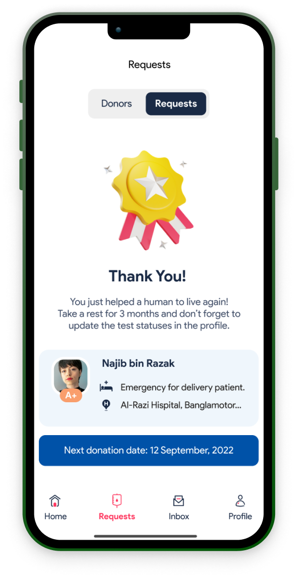
"The system to be built to appreciate the donors to carry on their good deeds. It may be socially and graphically."
"Building a platform so that the recipient can connect to the blood donor instantly and directly"
"The dashboard or other place where the recipients can track their requests, donors, and other info and the donors can track their valuable information like the age, weight, donation history, etc."
Wireframes and sketches
After imagining and understanding the competitive landscape, I jumped into designing the platform. I started designing the app first. The process begins with the paper wireframe. Paper wireframes helped me to make decisions about the contents and basic structure of the app.
Paper wireframe
Working through a couple of preliminary sketches, I realized some ideas and layouts I was thinking of wouldn't work. So I discarded the bad one and made or iterated to a good one. Also, I looked into more inspirations to find better versions of each screen. I moved to the digital wireframe only after finalizing the low-fidelity paper wireframe.

Low-fidelity wireframes

By creating a higher fidelity but somewhat preliminary version of our wireframes, I could work out some of the technical issues that would not be viable in BloodLink and tone down our high-fidelity screens into more realistic ones.

After ideating and drafting some paper wireframes, I created the initial designs for the BloodLink app. These designs focused on flow for emergency blood collection and getting to know who needs blood in an emergency.
Prototype
The high-fidelity prototype followed the same user flow as the low-fidelity prototype, including design changes made after the usability study.
Usability study & results
As BloodLink is a user-centric platform, I kept the users at the front and center of my project. I conducted four rounds of usability studies to test what my users thought about the design and what they wanted.
From interview to insights: process
The key interview questions was to find out the answers of the following questions:

How faster user can make requests to donors?

How faster it is to accept requests and contact donors?

How easy it is to make an account in the app?

Which parts and interactions users find hard or confusing?

My findings on the rounds of usability studies
Round 1 : lo-fi mobile wireframe - findings
It's essential to have an option for scheduling the donors for another day bayside emergency.
Option to chat with the donor to keep track of the progress and information sharing
An easier way to register in the app, like Google or Facebook sign up
Round 2: Hi-fi mobile mockup - findings
While registering, a dropdown for blood donation experience that contains 4-5 quick options- will save some cognitive load.
Detail view of the donors profile who has accepted the request.
Full-screen view of the blood requisition paper so donors can scrutinize it better.
Make patient photo upload optional.
Round 3: lo-fi responsive web - findings
Make a dropdown for “My requests” & “Request I accepted” in the All requests menu.
Auto suggestion for hospital name
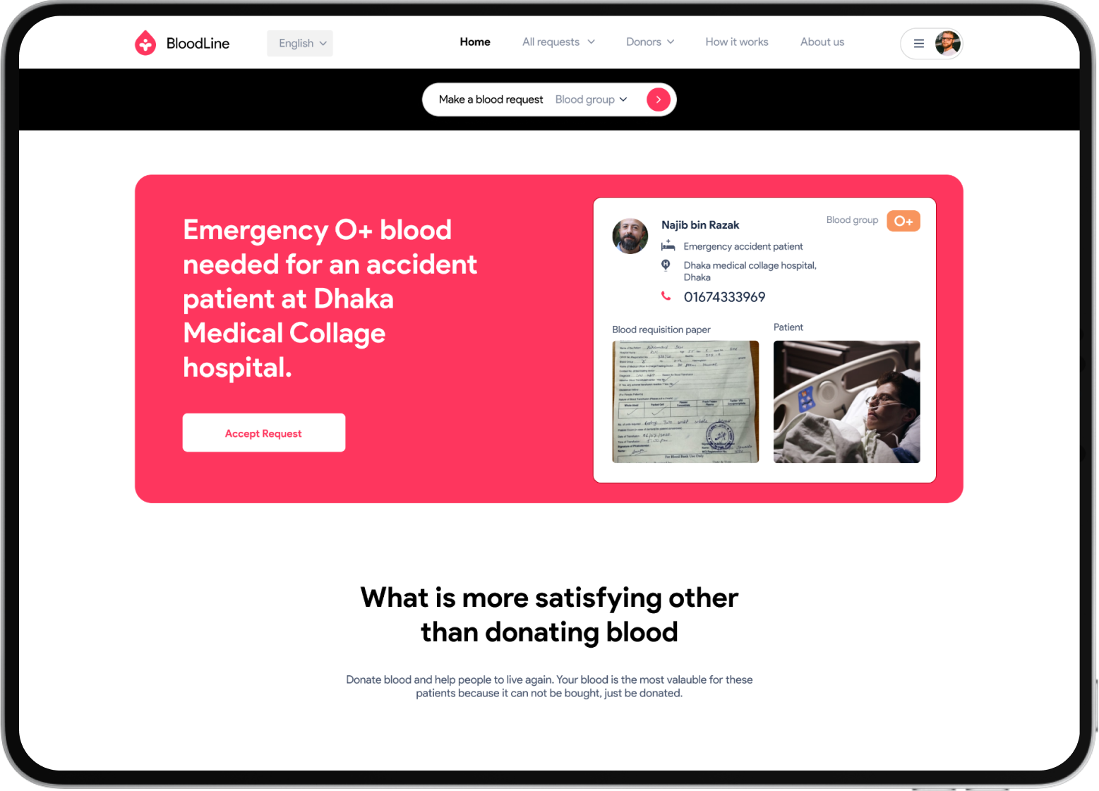
Make the emergency blood needed banner more prominent.
Round 4: Hi-fi responsive mockups - findings
Make the “Make a blood request” stripe more prominent in responsive web.
Add “weight” in the donor's profile information.
It extended the form field for making a blood request on the “All requests” page.
Place a toggle button in the profile for "I want"/"don’t want" to donate.
Post-study iterations
After the rounds of the Usability study, I iterated the screens and information so that they are aligned to the user's comfort. Some changes were easy to make. Sometimes I have to sacrifice my aesthetic taste.
Final design
A total of four versions of the design are produced, accumulating the three responsive versions. Since the project is a continuous process, I maintained a design system to make quick changes faster.
Webside design
Along with all functionalities the mobile app contains, the website contains contents like showing the donor of the day as part of social recognition for donors. It also includes all blood applications, which are filterable by groups.

Responsive web designs

For an equitable experience and inclusiveness, the responsive web is as important as the app. Most people will use the responsive web in an emergency. So I emphasized making the responsive designs intuitive as well. I followed progressive enhancement to make mobile-first web.

Accessibility considerations

Since I designed the products with the end-users from different backgrounds in mind, equitability and accessibility were a must.

• I put the language option to choose between Bangla and English. I placed the language option beside the logo, the most prominent place after it, so that users can easily find it.

• I made the responsive version in "Progressive enhancement" so that the design is mobile first. Most of the users will open the website on their phones.

Design system

Utilizing a soft red consisting of cool and calm colors felt like the perfect fit for the blood donation app. The faint red helps evoke a sense of emergency for uses, and paired with the black; it creates a nice balance between calm and energy. The primary typeface of choice for the app is Product Sans. I felt this typeface best fit the app due to its extreme versatility through uppercase, lowercase styling, and dark and light text fill.
Takeaways
Users shared that the app will make blood collection easier for the recipient. What I have learned that even though the problem I was trying to solve was a big one, diligently going through each step of the design process and aligning with specific user needs to be helped me come up with feasible and valuable solutions.

Also, many usability studies are needed because I did not have that much opportunity to collect types of participants like non-binary, 67 years aged participants, and participants from the rural area having low or no experience in using the app.

One quote from peer feedback was that:
“The app will reduce all of my pain and uncertainty of collecting blood for my father’s dialysis.”
See the process deck