Case Study
Process and tools
UX

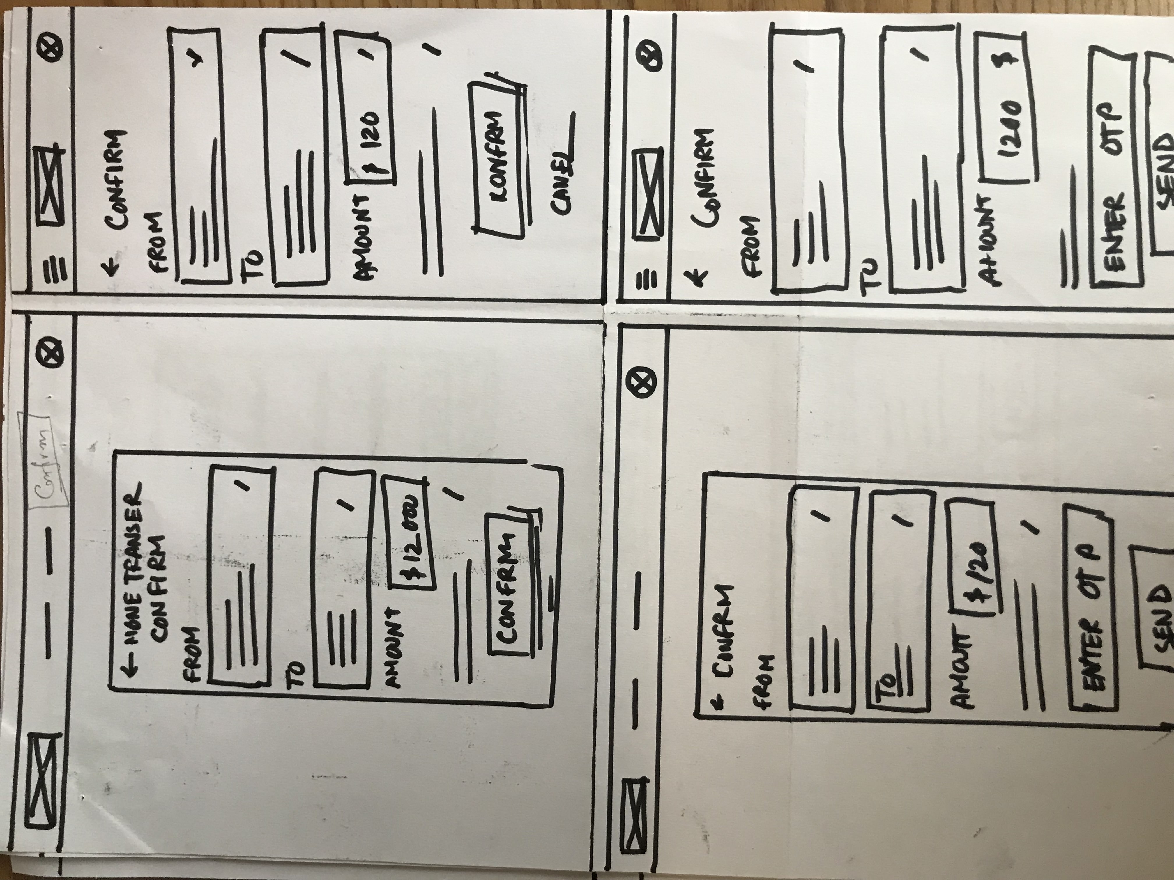
Case Study: Transfer balance quickly—UX Design for a balance transfer system.

Life is too short to waste time making a bank transaction. Here I present the most straightforward balance transfer system for online banking in Bangladesh.

Project Overview

Access is a multi-way balance transfer getaway for a local bank. The web app will help the users to send money to another account or mobile banking number very easily and quickly. Access targets busy people who need to make the transfer quickly and hassle-free.

The goal of the project
Design a responsive web experience that allows the users to make transactions quickly and keep track of their transactions.
My role and responsibilities
UX designer designing a web experience of money transfer flow from concept to delivery. My responsibilities are:

Conducting interviews,
Paper, and digital wire-framing,
Low and high-fidelity prototyping,
Conducting Usability Studies,
Accounting for accessibility,
Iterating on designs,
Determining information architecture,
and Responsive design.
My target audience
The primary target audience of Access is the busy people who have to use the online-banking systems, are between the ages of 20-65, have an understanding of online banking, and are used to devices like mobile or computers. The characteristics of these people include:

They are more concerned about simplicity than features.
They do not have all day to look for cool and unnecessary features the i-banking provides. The basic functionalities like sending money, making transactions to multiple mediums (mobile banking, for example), and keeping track thereof.
Key challenges and constraints
There were some challenges and constraints that make it harder to implement the design of the product how I wanted to. The major challenges include:
  • The budget constraints: I do not have that much budget to do more intensive research to go deeper into the service. Budget shortage made it hard to manage the most effective user interviews.
  • Lack of data for secondary research: It would be faster to conduct my secondary research about the problem to kick off if I had access to any report or data. But unfortunately, I did not find any data or information like that.
  • Hard to find the variety among the participants: I intended to include non-binary participants in my study. But unfortunately, there was no one I could manage.
KIckoff

I opted for the Design Thinking framework in Access's design process to make a seamless user-centric design. This framework helped to find the user's pain points, conduct several usability studies, summarize and synthesize study data, and bring changes accordingly.

Research conducted
I conducted foundational and primary research with 8 participants. I invited both types of participants, those who use i-banking often and those with little or no experience in i-banking.

I included participants with no such experience because I wanted to understand the conceptual model of the process and what this participant can imagine as a happy path to the process.

I conducted face-to-face interviews and asked them open-ended and non-leading questions to get their opinion on the i-banking they are using. The common frustrations are something:
"It is frustrating to send money to a
new account. I have to add the account as "Beneficiary" first!"
"It takes too many information in adding beneficiary."
"There is no place where I can find the transaction history of my account"
"Those websites are focused on only security, not aesthetic."
"It's too confusing to navigate while I use them in my mobile."
"They provide a lot of features, but often time they miss the features I actually want."
Research insights & pain points
This user group confirmed initial assumptions about Access's users, but research also revealed that time was not the only factor limiting users from using online money transfers.

Other user problems included difficulty adding beneficiaries, lack of website responsiveness, or challenges that make it difficult to complete the transaction or prefer mobile banking.

Most participants reported that they aren't happy with the existing interaction of making a transaction or managing the account.
90% of the participants stated that they find it difficult to make a transaction to a new account.
80% of participants stated Adding a new beneficiary is super complicated because a lot of information is needed about the beneficiary's account and bank.
65% of the participants stated that They don't find the transaction history of their account. So users have to call customer service to get the information.
50% of participants stated that it's easy to manage mobile banking apps like Bkash that a i-banking account.
Design Strategy

Finding the insights from the foundational research, I jumped into the design process. I conducted two sessions of the ideation process to see which solutions would be best for the users.

Initial ideation and design strategy
My foundational research helped me to understand the user pain points. It's time to make the persons I am designing. In this empathy step, I made it clear what our users look like by making personas. To understand the scope of improvement through this product, I made a user journey map to identify in which steps users feel frustrated and need improvement in experience.
Meet the Users
Imran Khan (42)
- Post-graduate
- Does Real State business
- Lives with wife and 1 child
- Very busy person
Imran is a busy person who is working with a remote management farm. He needs to make transactions 2-3 times to other accounts. But the existing online transaction system is so complicated and horrible that he prefers mobile banking. But the mobile banking app has constraints on transaction amount and daily transaction limit.
Sabila Munjireen (29)
- Landscape Architect
- Single
- Often needs to make transaction
- Concern about security.
Sabila is a landscape architect trying to build and manage her own business. Sabila needs to make a lot of transactions and keep the history. Currently, she prefers a mobile banking system instead of online because it’s more simple and can keep track of the transactions she made. She needs a hassle-free, secure, and unambiguous online translation system to make the transactions easily and intuitively keep track of the transactions.

User journey map

The user journey mapping made it easy for me to look into the typical user's steps to complete a successful transaction. The mapping made clear the opportunities for improvement that make the users happy.
Competitive audit report
The competitive audit helps me to understand the upside and downside of the existing i-banking systems. I conducted the audit on five competitions, from which three were direct, and two were indirect competitions.

The Audit Goal: Competitive audit on comparing the flow of making a balance transfer in different i-banking systems

The key things of the competitors I have compared are:

Who are your key competitors?
What are the type and quality of competitors’ products?
How do competitors position themselves in the market?  
How do competitors talk about themselves?
Competitors’ strengths
Competitors’ weaknesses
The Gaps
The Opportunities

See competitive audit
The gaps the competitors failed to address are
Most competitors failed to address user pain points on every task interaction.
Lack of knowledge about how real users use their app. They do not respond to the user appropriately.
Lack of intuitiveness and usability studies.
Opportunities I can parsue
A user-centric app that considers the use cases, user journey, and pain points.
Integrate core features and remove others that the user doesn’t need.
We can make the loveable by creating the app more user-centric by putting the user's opinion in front and center.
See competitive audit report
Wireframes and sketches
After the ideation and understanding of the competitive landscape, I jumped into designing the platform. I started designing the app first. The process begins with the paper wireframe. Paper wireframes helped me to make decisions about the contents and basic structure of the app.
Paper wireframe
Working through a couple of really preliminary sketches, I realized some of the ideas and layouts that I was thinking of just wouldn't work. So I discarded the bad one and made or iterate to a good one. Also, I looked into more inspirations to find out better versions of each screen. Only after finalizing the low-fidelity paper wireframe, did I move to the digital wireframe.

Low-fidelity wireframes and prototype

Picking ideas from my finalized paper wireframes, I jumped into the digital wireframe to make the functionality a life. The lo-fidelity prototype significantly helps me to make actual structures of the website. Then I made low-fidelity wireframe of the functionality to conduct the early usability study of the future design.
See low-fidelity prototype
Prototype
The prototype contains five major flows.
Making a transaction to an account,
Making a transaction to account from beneficiary OR recent history,
Transaction to new mobile-banking account
Saving beneficiary while making transactions
Transaction history which is filterable by platform and date.
See high-fidelity prototype
Usability study & results
The point of making Access a new way of making a transaction is to make it the user's way. Usability studies in this project help me to do that. I conducted two rounds of Usability Studies to see if I am aligned with what my users need.
From interview to insights: process
The key question of my two studies is below. I planned the research and invited five participants. I gave them four tasks and asked them four follow-up questions to understand how the user performed the functions and what they thought. What aspects should I improve?

How faster users can make transactions to another bank account?

How faster users can make transactions to mobile banking?

Is it helpful if we show them a register of their transactions?

How easily users add an account to beneficiary list?

The patterns that emerged upon making the affinity map made it clear that I needed to re-work my designs. The patterns are:
See emerged patterns and insights
It was observed that 2 out of 5 participants had trouble identifying the “Send money” option. This means finding the option for sending money to another bank account is confusing to our users.

It was observed that 4 out of 5 participants had confusion about how to add the recipient to the beneficiary. Adding recipients to the beneficiary list is hard for most users.

It was observed that 4 out of 5 participants had trouble identifying the “Send from saved” menu. This means that this “Sending from saved” menu is hard to understand by the majority of the users.

It was observed that 4 out of 5 participants didn’t receive OTP in the Bkash transaction. This means that majority of the users expect OTP in the Bkash transactions.

It was observed that 2 out of 5 participants became frustrated because they didn’t get suggestions while sending the money to the recipients they transacted earlier but did not save. The user needs to get directions from past transactions while entering account numbers.
My prioritized insights of two rounds of Study
Round 1 : lo-fi wireframe - findings
User needs an easy way to add beneficiaries while making the transaction.
User needs more clear clues about CTA related to select recipient from beneficiary list.
User needs confirmation via OTP while making a Bkash transfer
Round 2: Hi-fi mobile mockup - findings
User needs to know if the account is compatible with protocols like NPSB and EFT.
User need an option to search from beneficiary list while making a transaction.
User need filter by date in the transaction history screen.
Post-study iterations
After the rounds of the Usability study, I iterated the screens and information so that they are aligned to the user's comfort. Some changes were easy to make. Sometimes I have to sacrifice my aesthetic taste.
Takeaways
The design makes users happy because they realize that the system is designed keeping in mind their needs and constraints.

While designing the Access app, the foundational research and user interviews gave a very upper hand in making the solution. The interviews with the actual users and understanding their pain points are the place we designers should focus on first. The more we engage the user through study, the better the product will be.
See the process deck
Adnan
Atik

“It’s exactly what I want! I don’t understand why the banks do not implement system like this?”